How to get your mobile conversion rate to match higher share of traffic
Mobile shopping is bigger than ever, but are we seeing conversion rates to match?

Liz Worsley

The latest B2C Retail Benchmark Report from Episerver is based on billions of ecommerce sessions. It predicts mobile share of traffic will exceed 60% during peak shopping events. However, the report shows mobile conversion rates still trailing behind desktop. So, why do so many retailers and brands see this gap between their mobile traffic and sales?
How to optimize mobile conversion rates
In this piece, we examine the trends in consumer behavior and put forward ideas to give your customers a better mobile shopping experience. We identify some common user experience issues specific to mobile. We look at broader opportunities to optimize customer behavior and motivation, including personalization. And, we emphasize the importance of understanding your customers and taking the guesswork out of your customer experience design.
For quick reference, here is a list of the methods:
- Make your checkout as seamless as possible
- Reassure your mobile customers
- Be relevant
- Be recognizable
- Be personal
1. Make your checkout as seamless as possible
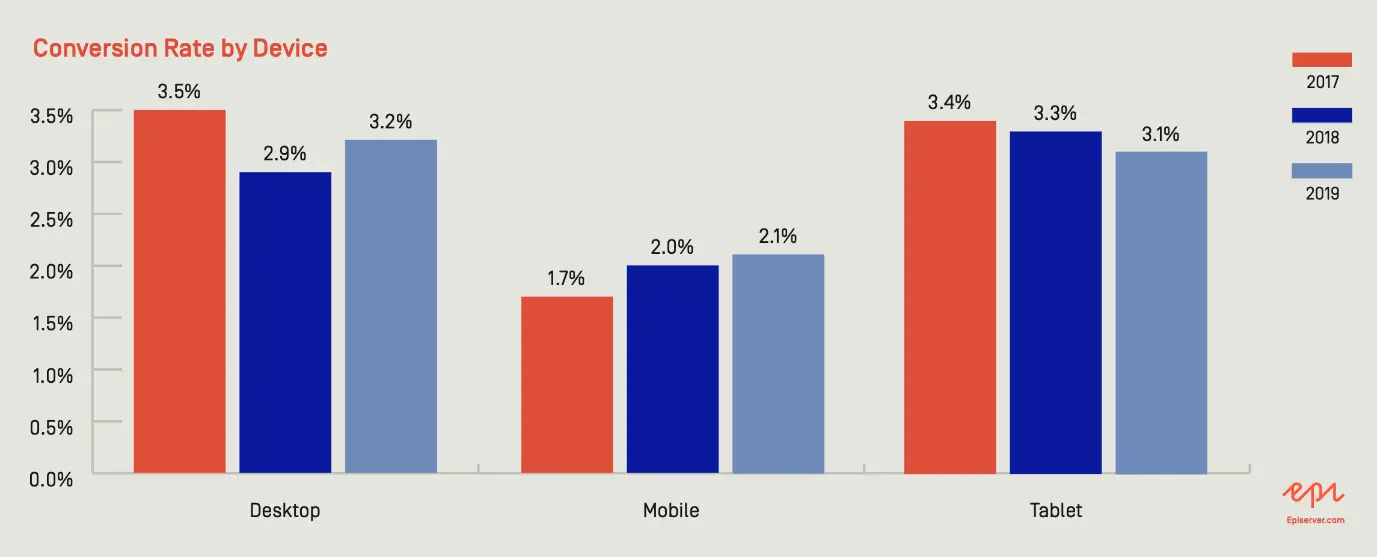
Mobile shoppers are lost at checkout. When we look at traffic, mobile usage is higher than desktop and add-to-basket rates are similar for mobile and desktop, but conversion rates for mobile are still falling behind desktop.
Filling in forms feels more difficult on mobile. Remove effort where you can.
Some best-practice form design will help users on all devices:
- Always offer guest checkout rather than forcing users to create an account to be able to checkout. It will feel less of a barrier if you enable them to create an account after they have checked out. Prepopulate account registration fields with data from the checkout process. If this is framed with the benefits of having an account, users will be even more likely to sign up.
- Minimize the number of form fields in your checkout flow to those needed to complete checkout. In website testing we often see fields such as ‘Where did you hear about us?’ throw off users. Not only is this question unnecessary effort, but some users don’t know how to answer it. As soon as you make users think, they can lose confidence and abandon.
Abandonment also occurs if your customers can’t accurately add their address. Address Line 1 and Address Line 2 are confusing and error prone, however long they have been around. Use a postcode lookup or place autocomplete to make adding an address faster and more accurate.
- Use the most effective types of form field. Drop-down menus can cause problems for mobile users. We often see drop downs used, where tap tiles or radio buttons would be faster.
- Reduce effort by offering payment methods such as Apple Pay and Shop Pay. On mobile this really streamlines the checkout flow because these platforms use your fingerprint or a pin instead of the tedious process of asking for your billing details.
2. Reassure your mobile customers
Fixing usability issues such as bad checkout design means your customers are able to buy your products. Good design also motivates people to want to buy the latest trainers or that stylish sofa.
Research by Comscore shows a massive gap in mobile use, between time online and money spent.
Mobile usage accounts for 67% of time online; but only 20% of spend.
Camscore calls this the ‘m-commerce gap’ which research attributes to security concerns as well as usability issues associated with mobile. Uncertainty is a conversion killer. Transparency and reassurance make people feel safe and motivates them to proceed. It is important to be mindful of this when designing for mobile users.
For every step of the path to purchase, ask what questions your customers have, and if they are being answered. For example, what will they charge me for delivery and when can I get my new trainers?
We know that delivery costs impact the decision to purchase. Episerver’s research shows a massive 76% of consumers would be dissuaded from a planned purchase if delivery costs are too expensive. If this information is hidden until the checkout flow, when mobile users are already more frustrated, the impact is compounded. Consider displaying delivery information on product pages. We also recommend the benefits of buying with you are located near the checkout call-to-action (CTA) in the basket.
Because of Amazon, shoppers now have higher expectations of all retailers. They have got used to cheaper, quicker delivery. The more you can streamline the buying experience, and promote the benefits of buying from you, the better you can mitigate the Amazon effect.
Understanding what motivates people to make decisions, and in particular the needs and motivations of your audience, gives you the power to encourage them to want to buy from you.
3. Be relevant
In a cluttered digital landscape, you need to pay more attention to attention. What this means is attracting the right customers to your website, and then matching their expectations, so they feel comfortable to progress.
Recognizable messaging, relevant content, and clear calls to action, are key to an effective first impression.
When we test retail websites, we often observe people on mobile who scroll through the homepage to get a sense of what’s being offered and what they should do next. On desktop, the header menu and visuals give users immediate signals about the type of website, but on mobile, where the menu is hidden, it is more effort for users to reach that understanding.
If your homepage does not effectively convey what type of products you offer, customers can fail to understand what you offer, and mistakenly assume it’s not relevant to them. This can cause higher bounce rates, and negatively affect brand perception.
Episerver’s retail data shows bounce rates on desktop dipping below mobile during 2019. This could indicate that mobile customers find it more difficult to assess the type of website, if it is relevant to them and what action they should take.
Display your main product categories on your homepage in an easy-to-scan form. On mobile screens, a clear value proposition, simple product category cards and text links attract the focus of attention.
4. Be recognizable
If landing pages are not consistent with your other marketing channels, your customers will feel less confident and motivated. We want to promote a feeling of safety for mobile users
We know a lot about how humans make decisions and what motivates them to take an action. Decades of behavioral science, and our own neuromarketing research, tells us that recognition is an extremely important factor in decision making.
Evolution has conditioned how we make decisions. To survive, we’ve needed to process millions of bits of data every second and make fast decisions. Considered decisions cost us energy, so when we are fatigued, we opt for the easiest and safest decision.
Our brains use cognitive biases to make fast decisions we feel are correct and safe. Cognitive biases are unconscious short cuts we’ve developed through our experience with the world. We all have hundreds of biases, and as designers we use these to affect motivation and behavior.
One of these biases you can easily apply, with good planning, is the mere-exposure effect: when things feel familiar, they are more appealing. Use consistent messaging and language throughout the entire customer journey to help customers progress with less effort, and less pause for thought.
It is vital that your search and communications strategy is aligned with your website content strategy and testing programme. When campaigns and conversion rate optimization (CRO) tests are run in silo, for example, the customer journey can become disjointed and the benefits of recognition are lost. Some of our clients have used our behavioral design audit to identify how and where to implement these psychological effects.
5. Be personal
We know people are using their mobile devices more and more. They are bombarded with notifications, advertising and content. They have many distractions. Your content needs to be meaningful and timely to get their attention.
Personalization amplifies the effect of recognition. We are more likely to respond to messaging and products that feel tailored to us. The more you understand your customers’ needs and behavior, the better you can deliver personalization. Episerver’s global shopper research (Reimagining Commerce 2020) shows that consumers are open to personalization if it is relevant, and this needs to be balanced with their fears around privacy.
When you understand your customers and where they are in their journey, you can deliver timely, relevant content that feels tailored. We help our clients identify how, where, and when to implement personalization using Customer Journey Mapping.
Customer Journey Mapping is a tool for systematically capturing insights about every interaction a customer has with you over time, including what devices they use for particular tasks. This identifies opportunities for improvement and what needs to be measured to truly understand customer experience.
This framework is ideal for connecting all of your customer research and data insights. It informs design decisions by evidence, rather than guesswork and opinion.
In this article, we’ve introduced some trends in mobile behavior on retail and brand websites. The big picture shows customers willing to spend more time on their mobile but a lot less of their money. It points to the checkout flow, navigation, and safety concerns, where better design can impact the mobile conversion rate.
It’s important, however, to understand your customers as well as these wider trends. Systematic customer feedback, research and testing, and measuring what matters, will tell you where and how you need to improve the journey for your customers.
About the author